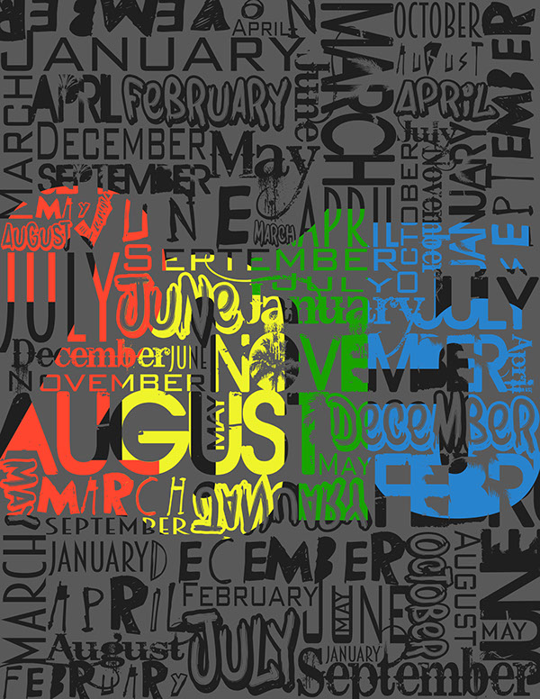
The calendars, We spot them on our desk every single day for so many years and never get bored of them. After all, they serve the best functionality aspects for our time management.
Let’s discuss some of the Unique Calendar Designs:
Unique Calendar Designs
-
Get a bit of crafty in nature
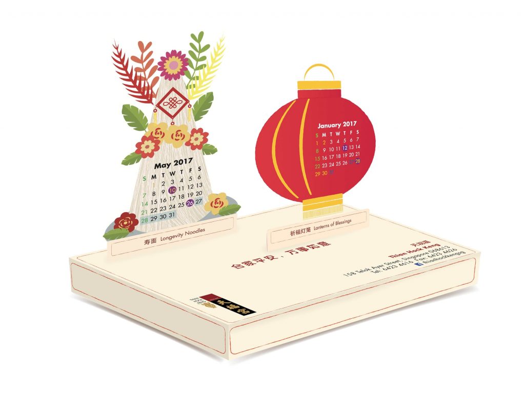
It is not necessary at all to go for the regular and run of a mill calendar design. To keep your clients, employees, vendors, and investors along with other stakeholders wait for your calendar every year to get adorned on their work desks, you need to use a bit of art and craft. Take a cue from the above-mentioned design. What a lovely design with the play of pop up cards for every month along with the Bing of traditional aspects as well. When am I getting this one for my desk?
-
Color Blocking in a unique way
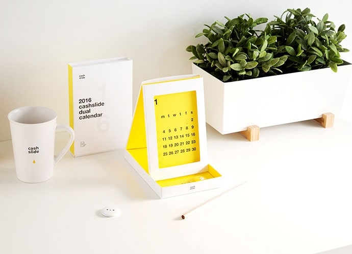
One of the main and vital thumb rules of designing and creativity is to always play with an array of color shades. And the calendar is no indifferent from the above mentioned. The above-mentioned design has played with the color block design in the most fashionable way, and the card sliding effect adds the unique functionality to it at the same time adorning the table. It demands your attention every month. Also, stick to your brand colors if you are going for the color block theme as it works as a wonderful recall factor.
-
Frame it up
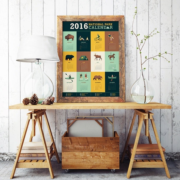
Oh my goodness! This is something never thought off and outlandish at the very same time. Who would have thought of coming up with the framed calendar to hang it up on your wall giving a tough competition to your wall frames and paintings? You can take a cue from the above-showcased example. I love the wooden frame and rusty effect to the overall look and feel. But of course, it is going with the theme of the brand. So yes, be always mindful to consider your brand architecture and theme while designing such calendar creative’s.
-
Tear it off
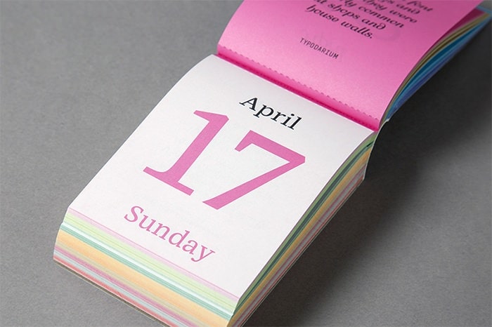
The design showcased above is not your usual calendars. And more than placing it on your work desk, it will surely add to the beauty of your travel bag or pouches especially for women as they love all such cute little things and elements to flaunt. Hence, it is an amazing idea for salons, spas, and fashion designer houses. It is palm sized, detachable, and handy. The front can be the date and the back of each card can be the design of the garments if you are a fashion house or a stylist.
-
Letterpress it
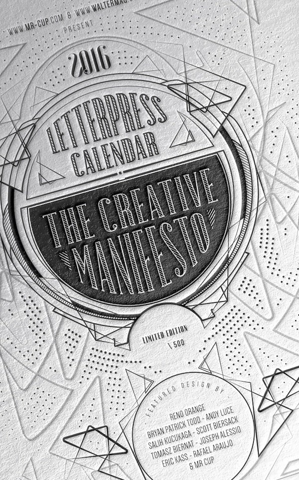
If you are considering the above-showcased design as you fancy it, take note of the two vital elements. It is the work of the designer and the printer as they will have to meet a couple of times to arrive at the required artwork. And secondly, it will surely add up to your marketing budget owing to the letterpress aspect of the printing technology. But it sure looks amazing and eye catchy. You can also add motivational quotes beneath every page to motivate your employees to strive harder for their goals and objectives.
-
The play of art and craft again
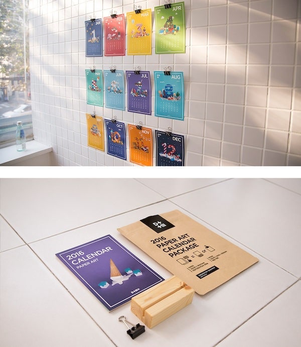
Calendar designs have a lot of options and alternatives in the schemes of art and craft. And one of the finest examples is the above-showcased design. All the leaves are separate and detached, and you can place as you fancy and as per your functionality needs. Place it on a clipboard, stick it on your desk, or put on a holder adorning it on your desk; it is quite versatile in nature along with being creative at the same time.
-
Play with a new image on every leaf
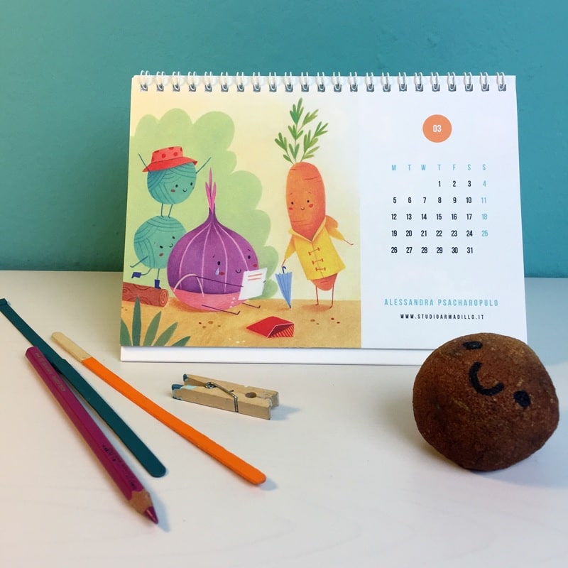
This is like the most traditional and old school designs, but there are a lot of artists, designers, and even thorough corporate professionals prefer to go the old school way. It is very basic but so very functional without beating around the bush for checking the current date task. Many of the companies go for two options, one with the regular one and others that is more towards an edgier part of the design and creativity.
-
Elongate the size
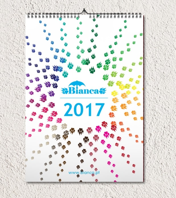
Rather than going for the regular square or a rectangular size of the calendar, take a cue from the above design and elongate the size of the calendar if you have more to display and talk about. It does give a magnanimous feel as compared to the regular ones and surely stands apart from the rest in the market. But make sure to make the optimum utilization of the space available keeping a breathing white space at the very same time.
-
Get a bit more functional
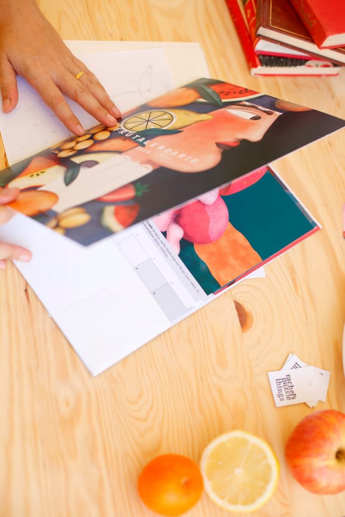
In this case, your calendar is much more than a calendar. It serves the aspects of functionality as well. You can use it as your daily diary or a note pad. But it is predominantly a calendar as you can’t just run away or deviate from the basic idea. It is quite an interesting and enticing take on the basic calendar designs. But do make sure to use the best of design elements as many people are going to watch out for the same.
-
Artistry, anyone

If you are a design agency, painter by profession, architectural firm or an interior designing studio; this can be your best pick. It is oh so artistic in nature as it takes the major space and we have to look at it twice to spot the dates and month. Here, the work of the artist or a designer is doing all the talking. Basically, the intention is quite different in this case.
-
Confuse them a bit
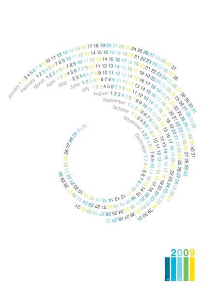
This design may not be liked by you and even by your clientele, but it is a very good option if you are a design or an advertising agency and you want to flaunt your creative and strategic ideas. It is surely confusing as hell, but it has an equal amount of charm and creativity. And it is a head turner, and people will take not only second but even third and fourth looks at the design to spot the month and date. They have made it quite easy with the color coding elements. That’s why we say, confuse them a bit and do not go overboard at all.
-
Play with the fonts and textures
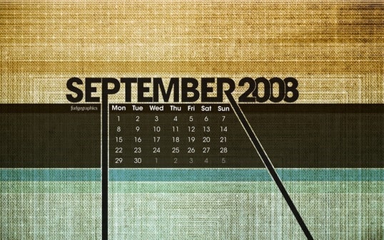
Now, this is purely a play of fonts, designs, patterns, colors, and textures. The dates are mentioned in a small, but a prominent box and the design takes away the major pie of the cake. And that’s what actually attracts to the eye. And when we come to think about it, nowadays we spot the date, day, and month on our smartphones with the help of reminders and alarms. And the major work of the physical calendar is to add to the beauty of our wall and the desk. So why not go a bit over the top with the design.
-
The work of the illustrations
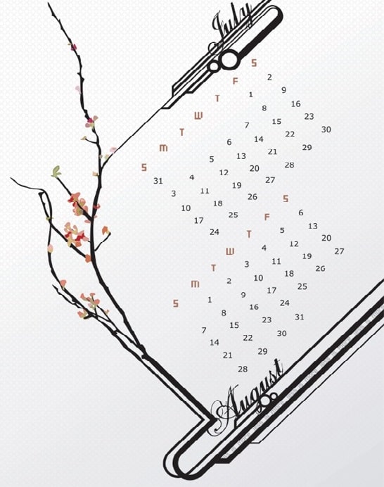
As we mentioned in the above point that the major work of the calendar is to add to the beauty of the desk and please our eyes amidst all the chaos at the workplace. And you can take a cue from the above showcased illustrative design that is minimalistic yet classy and creative in nature and the overall approach. And I personally love the way dates are placed. How creative, isn’t it?
-
Play with the human elements
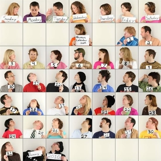
Now, this is yet another creative approach in designing the calendar. They have used the varied moods of people for the different dates of the month. And if you are a human resource firm, this is definitely your pick. We suggest, look no further and take this idea for your next calendar design. But make sure that the human faces depicting all the emotions are not offensive in nature and are not demeaning in any possible fashion.
-
Take a comical approach
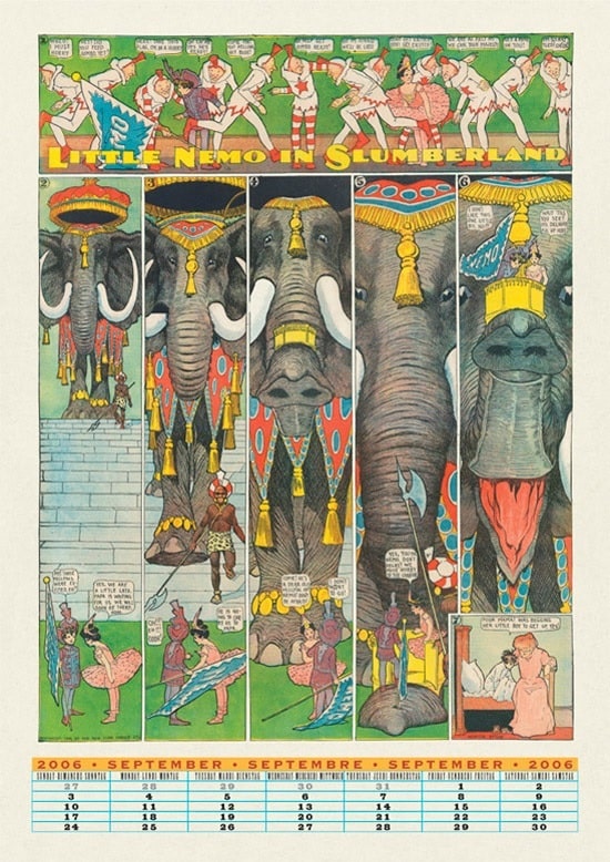
We all have grown reading comics of our favorite cartoon characters. So why not take your investors, customers, and other stakeholders of the firm a trip down the memory lane just like the above-mentioned example. The imagery, the play, and placement of the cartoon characters, and all the dialogues in the thought bubble format are giving all the feel of sheer nostalgia. It is sure to grab instant attention and accolades are coming your way.
-
The mentioned specialty of each month
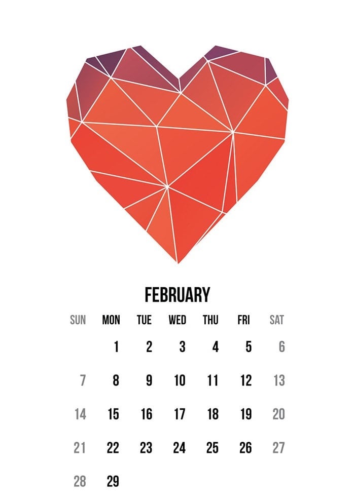 Now, this can be a bit of tricky stuff as you need to be very careful depending on your country of origin and the target audience that you are catering to. You can generalize to some extent, but it depends on the merit of the case depending on the factors mentioned above. The above-showcased example displays the element of heart for the month of February. You can display festivals, seasons, and much more. But you need to be quite careful with the aspects of design and how you are using the elements to signify each month of the year.
-
Add a dose of motivation
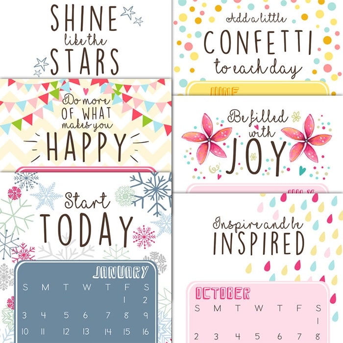 Yeah, that sounds a bit old school too but adding the quotes on motivation does add a stroke of creativity in your calendar designs. But keep in mind to not take the route that displays quotes that are too high on philosophy and life. Keep it short, sweet, and simple just like the above-mentioned example.
-
Water painting effect
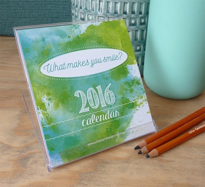 Now, this is also purely from the perspective of design and using creative elements rather than being edgy and outlandish in nature. And water painting effects as showcased in the above example are a huge rage this season and are pleasing to the eye and mind at the same time. You can showcase your brand attributes, core values, strengths, and so much more. Just that your graphic designer needs to be creative and nearly perfect in nature.
Some tips to design your calendar
Your graphic designer needs to think out of the box and have a strategic approach in nature. But along with your designer, you also need to provide your inputs as well as per your expertise and experience. Select the printing paper that does justice to your design and all the creative elements used. And even your printer should have high-end and quality techniques and should have a strong acumen as well. With the approach of curating something that is edgy and unique in nature, do not forget your brand roots, core values of the brand, and the entire brand architecture and objectives. Even the nature of the product and service offerings also needs to be considered along with the taste of your target audience.
Keep in mind the digital mediums as well.
As apart from printing your calendar, you will also need to send your target audience on social media and digital platforms as that is a new era that we are living in and we have to embrace the change with open arms.
Conclusion
As discussed above, calendars are one of the most traditional and old modes of corporate and branding opted by big and small firms but is still used and preferred by one and all even after the rage of smartphone and an ample of apps on them. We can always let our creative juices flow with the calendar designs and try out so many options and alternatives.
