Have you ever entered a room and felt at once at ease? Or walked into a space that gave you a sense of vitality and aliveness? The power of color holds the key. Colors have a remarkable power to awe us, change the atmosphere of any room, and influence our general well-being. Creating harmonious and powerful places that connect with the residents on a deeper level requires an understanding of color psychology in interior design.
The colors you choose are important, whether you want to create a calm haven, a lively and stimulating space, or a cozy haven. Discover how various colors can influence our experiences in our homes as we delve into the fascinating realm of color psychology in interior design. Prepare to use their psychological influence to design a home that genuinely resonates with your spirit.
Color psychology in living room interior design plays a crucial role in setting the tone and mood of the space. Different colors evoke distinct emotions and influences – soft blues create a calming, tranquil atmosphere, while vibrant reds energize the room and stimulate conversation. Greens promote relaxation and harmony, and yellows can add a cheerful, uplifting vibe. Neutrals like beige and gray provide a versatile, balanced backdrop, allowing other accent colors to shine.
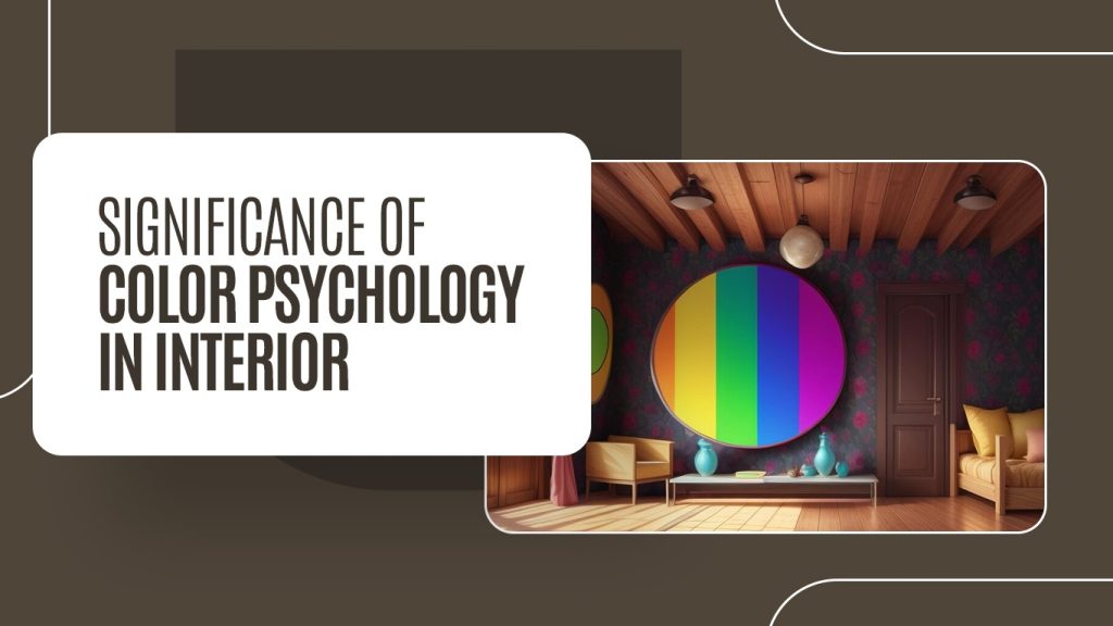
The Significance Of Color Psychology In Interior Design:
When working on your home’s design, you should consider the following factors:
Emotional Influence: Color theory can stir particular emotions and sentiments. Warm tones can instill a feeling of energy and excitement, while cooler shades foster calmness and serenity. By thoughtfully using these colors throughout your home, you can cultivate the desired atmosphere for each space.
Mood Improvement: Are you aware that colors can boost your mood and contribute to your overall happiness? Absolutely! Lively and vivid colors bring joy and positivity, infusing a space with vibrancy and energy. Conversely, soft and subdued shades help to create a peaceful environment, ideal for moments of relaxation and reflection.
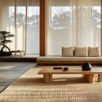
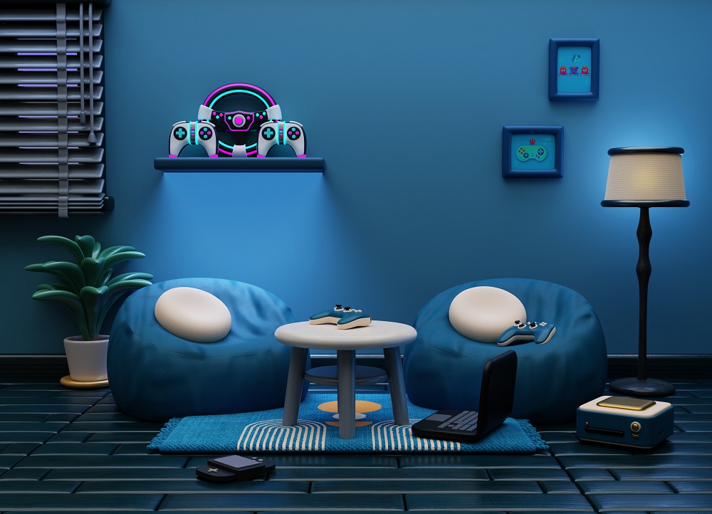
The study room color can greatly influence focus and mood. Cool tones like blue and green promote calmness and concentration, making them ideal for studying. Warm colors like yellow can boost energy and creativity, but too much red may cause restlessness. Neutral tones like beige or light gray create a balanced, distraction-free environment.
Visual Interpretation: Colors can profoundly affect our perception and experience of a space. Lighter shades can make a room feel more airy and expansive, while darker colors foster a more intimate setting. By adjusting the color scheme, you can add depth and dimension to a room, enhancing its visual appeal.
Personal Reflection: Colors serve as a powerful form of self-expression and are a fantastic way to highlight your individuality. Gaining insight into the psychology of color enables you to customize the color palette to your liking, allowing you to craft spaces that align with your style and preferences.
The Psychological Effects of Various Colors:
Let’s explore some well-known colors and their influence on different spaces, as well as how they can be combined with other hues to achieve harmonious home interiors.
Color psychology for study room decor focuses on creating an environment that enhances focus, productivity, and calmness. Blue tones are ideal for promoting concentration and tranquility, while green fosters a sense of balance and reduces eye strain, making it perfect for long study sessions. Yellow can spark creativity and optimism, but should be used sparingly to avoid overstimulation. Neutral shades like beige or gray provide a calm, non-distracting backdrop that lets the mind stay clear and focused. By choosing the right colors, a study room can become an inspiring space that encourages learning and mental clarity.
Blue Color Psychology in Interior Design:
Representing calmness, serenity, and tranquility, blue can transform any area into a peaceful haven that promotes relaxation and renewal. The color blue beautifully reflects the expanse of the sky and the serenity of the sea, evoking sensations of peace, balance, and stability. This makes it a great choice for environments where you wish to unwind and find comfort. Brighter tones like sky blue or baby blue can instill an airy and spacious ambiance, making them suitable for compact areas or bedrooms that lack sufficient natural light. Conversely, richer tones such as navy or royal blue convey a sense of elegance, making them perfect for crafting a sophisticated atmosphere in the living room.
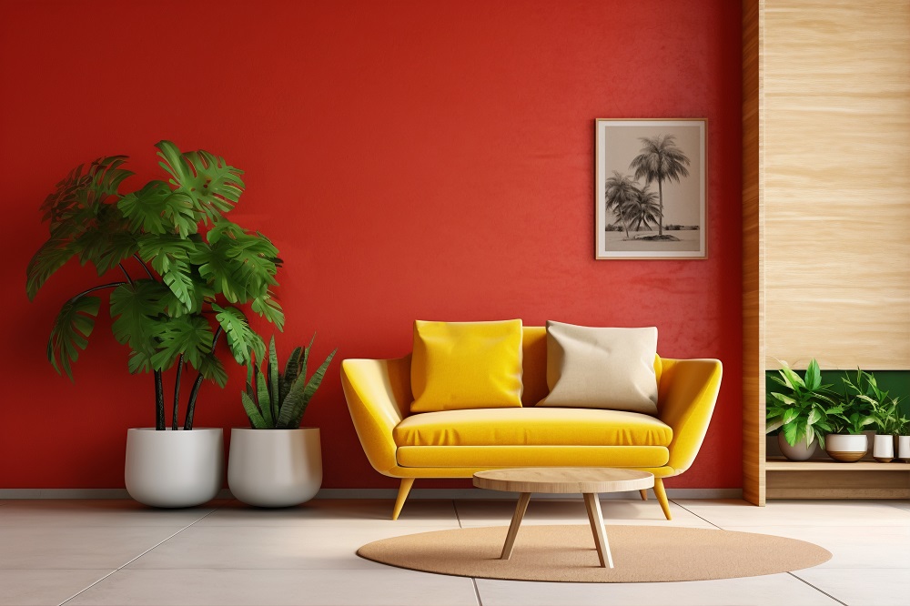
Red Color Psychology in Interior Design:
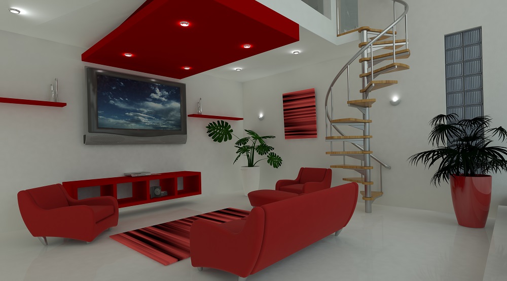
Picture walking into a space that instantly captures your attention, sparking feelings of enthusiasm and vigor. That’s the influence of red in interior design! Bold, lively, and undeniably eye-catching, red is a hue that demands recognition. In the realm of interior design, red is linked to a variety of intense emotions, making it a favored option for those looking to foster a vibrant atmosphere in their living environment.
Green Color Psychology in Interior Design:
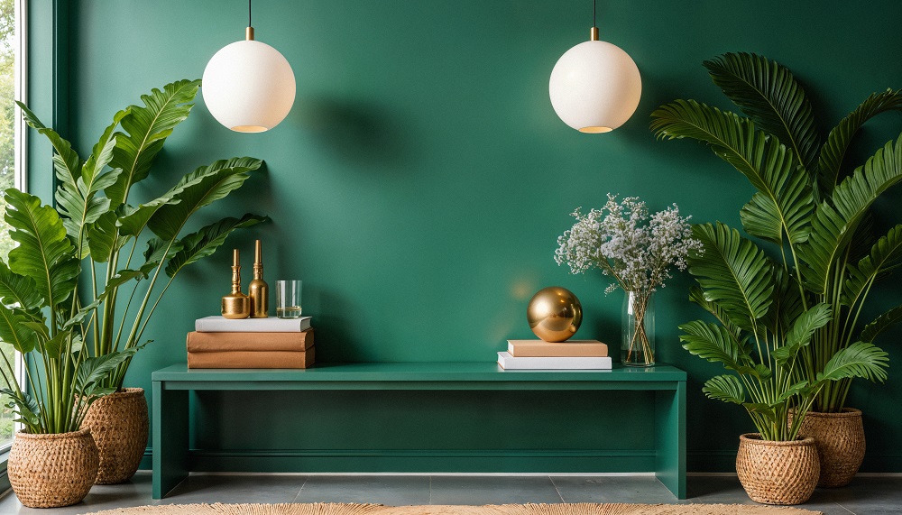
Due to its connection with nature and the outdoors, green fosters a feeling of balance and harmony in interior spaces. Research indicates that being around greenery can enhance mental well-being and alleviate stress. Consequently, entering a room adorned with green walls can quickly uplift your spirits by establishing a revitalizing vibe.
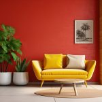
Yellow Color Psychology in Interior Design:
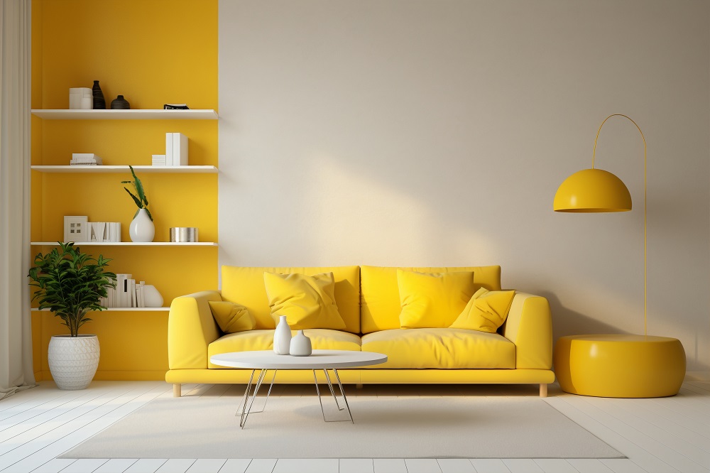
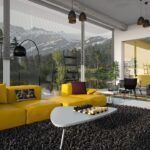
Integrating yellow into your interior design can undoubtedly bring a sense of optimism and warmth to your home. Its bright and cheerful nature has a unique power to light up spaces and foster a joyful environment. This is why yellow is linked to happiness, excitement, and artistic expression. A yellow couch, bed frame, or even yellow throw pillows can introduce a splash of color and life to your surroundings.
The Psychology of Purple Color in Interior Design:
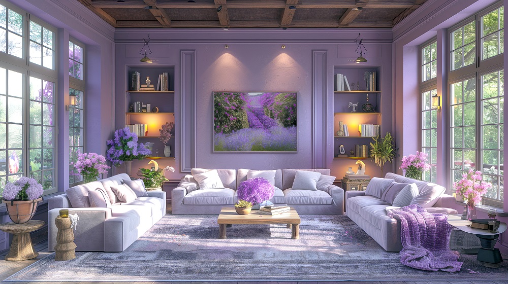
Have you ever considered how a color can embody luxury, intrigue, and drama simultaneously? That’s the psychological influence of purple. Featuring rich and royal undertones, purple brings an air of sophistication to any environment. The spectrum of purple shades ranges from deep and dark tones like royal purple or eggplant to softer versions such as lavender or lilac, offering diverse and engaging design options.
Brown Color Psychology in Interior Design:
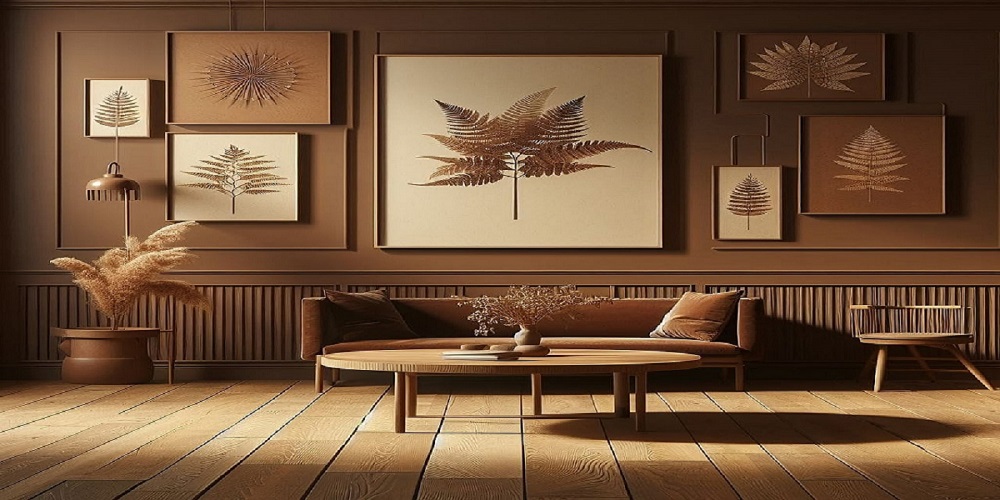
When it comes to designing warm and inviting environments, brown stands out as a top choice. This classic shade brings a hint of earthy sophistication to any space. As it represents stability and a bond with nature, brown often evokes feelings of comfort. Similar to the calming sensation of a warm cup of cocoa on a cold day, brown hues create an ambiance of warmth and satisfaction. This makes it a perfect selection for living areas where a peaceful atmosphere is crucial.
One of brown’s impressive attributes is its capacity to impart an earthy feel. Whether it’s luxurious mahogany furniture, a chocolaty brown accent wall, light sandy cabinets, or a deep brown leather couch—this color offers great versatility. Lighter variants of brown suit beach-themed or Scandinavian designs exceptionally well. Conversely, they can also enhance traditional or rustic interior styles beautifully.
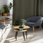
Color psychology and hanging plants can work together to create a harmonious and refreshing environment. Green, often associated with nature and calm, is amplified by the presence of hanging plants, which bring a sense of tranquility and rejuvenation to any room. Soft, neutral colors like beige or light gray can complement greenery, providing a serene backdrop that enhances focus and relaxation. Additionally, warm tones like yellow or earthy browns can create a cozy, inviting atmosphere when paired with plants.
Quick Home Décor is an exclusive destination for those with a tremendous thirst for art and decor. We bring you the absolute gateway to embrace the magic of designing. We love to share creative home décor thoughts & as well as DIY design ideas, through which our readers can create a better and happier atmosphere in their home décor.