Our capacity to concentrate, learn, and perform well is significantly influenced by the setting in which we study. A properly planned study space with the ideal color scheme can significantly boost our motivation and productivity. Not only are the colors we choose for our study areas decorative, but they can also affect our mood, level of focus, and general learning process.
This blog post will discuss the significance of choosing the right hues for your study space and provide you with a variety of creative suggestions for color schemes to create the perfect atmosphere. The hue you choose for your study area can have a big impact on whether you want an energetic area that inspires creativity or a tranquil and peaceful setting for intense concentration.
Come learn how carefully chosen color schemes may turn your study space into a productive and educational haven where you can also find the solution to the age-old issue of what color works best in a study space.
Feng shui plants also help in diminishing the negative vibrations of study space.
Classic Cream and White

The traditional white and cream color scheme is a timeless option for a study room and is one of the many fantastic study room color ideas. It is the perfect background for concentrated learning and work because of the atmosphere of refinement and peace that these muted colors produce. Because of its intensely warm undertones, cream color schemes add coziness, security, and comfort to any area they are utilized in.
This combination creates a refined and well-balanced atmosphere for concentration while also making extended study sessions more welcoming. Because cream and white are believed to minimize visual distractions, they help you focus on the task at hand. These two colors’ delicate contrast gives the room dimension and depth without becoming overpowering.
Beige and White

For a study space, the color combination of beige and white is cordial. Warm neutrals like beige give the room a cozy, tranquil feeling. It offers a subdued background that is easy on the eyes and promotes concentration. As the secondary color, white gives the space a fresh, airy vibe that enlarges and brightens the space.
This combination finds harmony between simplicity and calm. Because they are classic and adaptable, beige and white let you express your individuality with furniture and décor. When combined, they produce a calm, organized space that improves focus and productivity when studying.
Yellow and White

A bright and energizing color combination for study space is yellow and white. The color yellow, which is linked to energy and positivity, gives the room more vitality. It’s a great option for a study space because it fosters creativity and a positive vibe. The white secondary hue creates a crisp, well-balanced background that highlights the yellow accents.
This combination provides a vibrant mix of inspiration and concentration. Perfect for professionals and students looking for a bright and upbeat workstation, yellow and white combine to produce a vibrant and energetic environment that can increase excitement and productivity.
Lavender and Grey
Grey and lavender combine to create a soothing color scheme that strikes a balance between elegance and calmness in a study space. Lavender is a calming, soft hue that encourages a relaxed atmosphere that is good for focus and rest. It’s a great option for lowering tension and improving concentration when working or studying. Grey gives the room a sense of refinement and calmness while also bringing in some elegance.
Lavender and grey create a sophisticated yet peaceful atmosphere that enhances well-being and mental clarity. This combination creates the right atmosphere for learning and productivity, making it great for anyone who wants a fashionable yet tranquil study space.
Cedar Green and Coffee
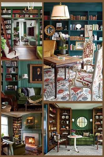
In a study space, the combination of Cedar Green and Coffee produces a cozy and welcoming feeling. Rich and earthy, cedar green is a great color to use to encourage relaxation and focus since it conveys a sense of peace and nature. It gives a hint of refinement and coziness when paired with Coffee, a rich and comfortable tint. This combination delivers a soothing warmth and a beautiful blend of colors inspired by nature, making it ideal for concentrated work and study.
In a calm yet sophisticated environment, the earthy tones of Cedar Green and the reassuring depth of Coffee create a well-balanced and inspirational place that promotes productivity and intellectual pursuits.
White and Ultramarine Blue

White and Ultramarine Blue together create a bright and energizing atmosphere in a study space.
Ultramarine Blue, a deep and striking shade, adds attention and vitality to the space, while white, which is known to foster a sense of cleanliness and tranquility, balances everything out. This combination offers a dynamic environment that fosters creativity and attention by creating a startling contrast.
Because of its relaxing mental effects, ultramarine blue pairs well with white to produce a visually pleasing and well-balanced atmosphere. The end effect is a study space that encourages productivity and mental clarity, making it the perfect option for people looking for a balance between calm and inspiration.
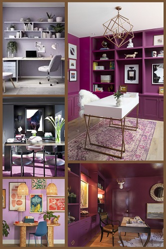
Red and White

For a study space, the hue combination of red and white is daring and energizing. Red is a strong, vivid color that represents willpower, passion, and vigor. When used with White, it produces a striking contrast that inspires drive and imagination. White provides a sense of clarity and openness by acting as a neutral background that counteracts the intensity of red.
This combination is perfect for a study space where productivity and focus are key, as it can evoke a sense of urgency and passion. With the red and white pair igniting a strong sense of purpose and drive, it’s a great option for people who do best in environments that push them to stay aware, engaged, and motivated.
Pale Green and Grey

A study room with a color scheme of grey and pale green radiates refinement and serenity. Pale green, which is evocative of peace and nature, gives the area a calming and revitalizing atmosphere. When paired with grey, it provides a contemporary and well-balanced look. Pale Green is made to shine out as the main feature of the neutral, timeless background that Grey provides. This combination creates a calm environment that is perfect for learning and concentration. It promotes harmony and balance, which makes it a good option for a study space where productivity and calm studying are crucial.
The combination of pale green and grey creates a calm, concentrated atmosphere that is ideal for people looking for a sophisticated, yet serene, setting for their academic or professional endeavors.
To improve green shade in room ,we can also use green hanging plants is abetter option to give natural look for study space.
Quick Home Decor truly understand that designing is not the single facet of home décor, but the aspects to bring more allure, art, and self-expression to a home can also hold the outmost contribution to any home décor. Nowadays People are looking forward to creating beautiful DIY design ideas. As different people across the world have various senses of décor and art.
In summary:
In conclusion, selecting a color scheme for a study space is not random. The secret is to select hues that align with your objectives, whether you go for the traditional Cream and White for ageless elegance, the energizing Yellow and White for a rush of vitality, or the soothing Lavender and Grey for peace. Recall that the appropriate color scheme can transform an unassuming study space into a creative and effective sanctuary. Thus, choose your color scheme carefully and turn your study area into a center for creativity and focus.